Decoding Typeface Units for Web: A Recipe for Typographic Success
The Pixel Predicament: Why Not Just Stick with Pixels?
Pixels (px) are seemingly straightforward. 16px is 16 pixels, right? Easy peasy. While seemingly simple, pixels have a significant drawback: they don’t scale with user preferences. If a user has set their browser’s default font size to be larger (for accessibility reasons, for example, due to visual impairment), pixel-based text will remain stubbornly at its fixed size. This creates a poor user experience, potentially excluding users who rely on larger default font sizes for readability. Furthermore, pixel-based layouts can struggle with responsiveness across different screen sizes.
Enter the Relatives: Ems and Rems – The Dynamic Duo
This is where relative units like ems and rems shine. They scale relative to a base font size, offering flexibility and accessibility.
- Ems (em): An ’em’ is relative to the element’s own font size. If a paragraph has a font size of 16px, 1em within that paragraph is also 16px. If you then set the paragraph’s font size to 20px, 1em within that paragraph becomes 20px. This can be confusing because ems compound. If a nested element also uses ems, it’s relative to its parent’s font size, which might already be scaled. This compounding effect can make it challenging to predict the final size of elements, especially in complex layouts.
- Rems (rem): A ‘rem’ (root em) is relative to the root element’s font size (usually the <html> tag). This makes rems much more predictable. 1rem will always be the same size, regardless of the element it’s applied to. This makes them ideal for creating consistent scaling across your entire website. You define the root font size once, usually in the <html> or :root CSS selector, and then use rems for all other font sizes.

Illustrating the Difference: A Practical Example
Imagine your root font size is 16px.
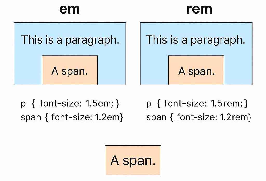
- p { font-size: 1.5em; } This paragraph’s font size will be 24px (1.5 * 16px).
- p { font-size: 1.5rem; } This paragraph’s font size will also be 24px (1.5 * 16px).
The difference becomes apparent with nested elements. If you have a <span> inside the paragraph:
- span { font-size: 1.2em; } The span’s font size would be 28.8px (1.2 * 24px) because it’s relative to the paragraph’s 24px.
- span { font-size: 1.2rem; } The span’s font size would be 19.2px (1.2 * 16px) because it’s relative to the root’s 16px.
This example clearly demonstrates the power of rems for maintaining consistent scaling.
Percentages (%) – Similar but Slightly Different
Percentages work similarly to ems, but they’re relative to the parent element’s font size. Like ems, they can also compound, leading to similar challenges in predictability. While percentages can be useful in certain situations, rems generally offer a more manageable and predictable approach to scaling font sizes.
Beyond Font Size: Scaling Other Properties
The principles of relative units also apply to other CSS properties:
- Padding and Margins: Using ems for padding and margins allows these properties to scale proportionally with the font size of the element, maintaining visual harmony.
- Media Queries: Rems can be used within media queries to create breakpoints that adapt to different screen sizes while maintaining a consistent relationship with the base font size.
Viewport Units (vw, vh, vmin, vmax) – A Word of Caution
Viewport units are relative to the viewport’s width and height. They can be useful for creating responsive typography that scales with the screen size. However, they should be used with caution. Directly setting font sizes with viewport units can lead to extreme variations in text size across different screen sizes, sometimes resulting in text that is either too large or too small. They are often better used in conjunction with calc() to create more nuanced scaling.
Best Practices:
- Establish a Base Font Size: Define a base font size in your <html> or :root selector. This is the foundation upon which all other font sizes will be based.
- Embrace Rems for Font Sizing: Use rems for setting font sizes across your website. This ensures consistent scaling and improves accessibility.
- Leverage Ems for Relative Scaling: Use ems for sizing elements relative to their content, such as padding, margins, line heights, and even some icon sizes. This ensures these elements scale proportionally with the text.
- Maintain Consistency: Avoid mixing too many different units. Stick to a consistent approach to keep your CSS maintainable and predictable.
- Test Thoroughly: Always test your typography on different devices and browsers. Ensure your text looks good, is readable, and scales appropriately across various screen sizes and user settings. Pay particular attention to how your typography behaves when users change their default font size.
- Consider Line Height: Don’t forget line height! It’s crucial for readability. Use relative units like ems for line height to ensure it scales proportionally with the font size.
Mastering the Art of Scalable Typography
Understanding typeface units is crucial for creating a robust, accessible, and responsive web design. By embracing relative units like rems and ems, you can build websites that adapt to user preferences and provide a better overall experience. While pixels might seem simpler initially, the long-term benefits of using relative units far outweigh the perceived complexity. So, ditch the pixel-perfect mindset and embrace the power of scalable typography! Your users (and your website’s maintainability) will thank you for it.


