In the world of User Experience (UX) design, creating seamless and user-friendly digital interfaces is crucial. Whether you’re designing a mobile app, a website, or an animation software dashboard, understanding how users interact with a system can make or break your product. One of the most practical and cost-effective methods to identify usability issues in a design is Heuristic Evaluation.
As a student pursuing design studies, learning about heuristic evaluation not only enhances your UX research skills but also improves how you think about user interaction. This blog will guide you through the concept, process, benefits, and application of heuristic evaluation in UX research.
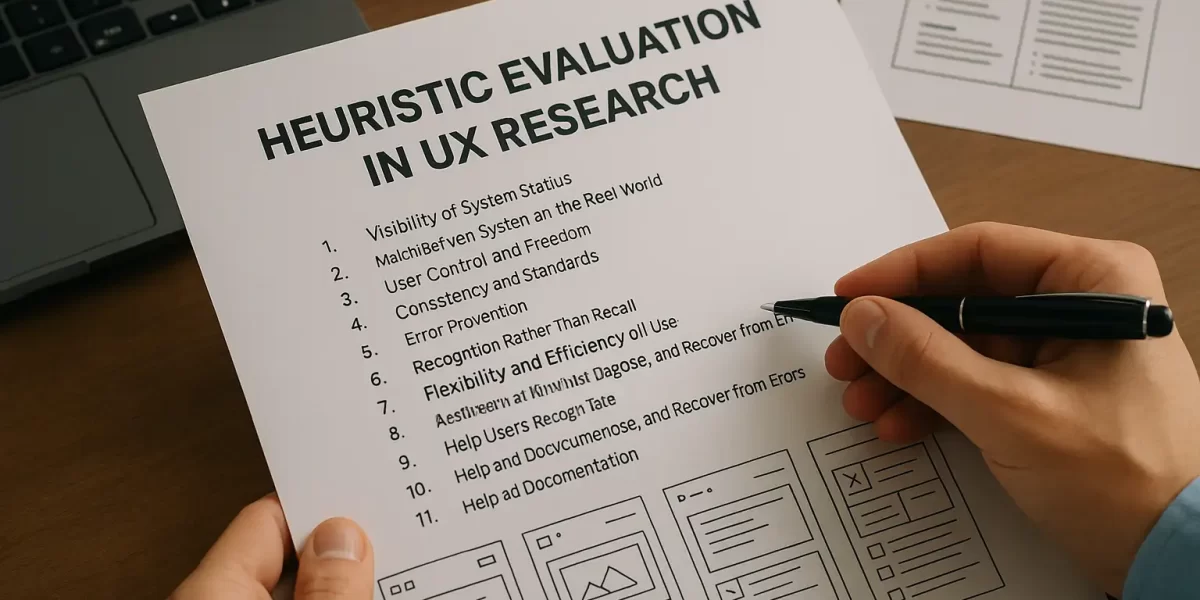
What is Heuristic Evaluation?
Heuristic Evaluation is a usability inspection method where a small group of evaluators examines a user interface and judges its compliance with recognized usability principles, known as heuristics.
It was introduced by Jakob Nielsen, a pioneer in the field of human-computer interaction. He proposed 10 usability heuristics that are still widely used by designers and UX researchers today.
Unlike user testing, heuristic evaluation doesn’t involve actual users. Instead, expert reviewers assess the interface based on their understanding of user behavior and usability standards.
Why is Heuristic Evaluation Important in UX?
For design students, understanding the importance of heuristic evaluation can be a game-changer in their careers. Here’s why it matters:
- Quick Identification of Problems: It allows UX designers to identify usability issues early in the design process—before the product goes live.
- Cost-Effective Method: Since it doesn’t require a full-scale user test, it saves time and resources—perfect for student projects or startups.
- Improves User-Centered Thinking: It teaches you how to view design from the user’s perspective, which is critical for success in the UX industry.
Jakob Nielsen’s 10 Usability Heuristics – Explained
Let’s explore the 10 heuristics that form the backbone of this evaluation method. Each heuristic acts as a guideline that helps designers analyze user interfaces effectively:
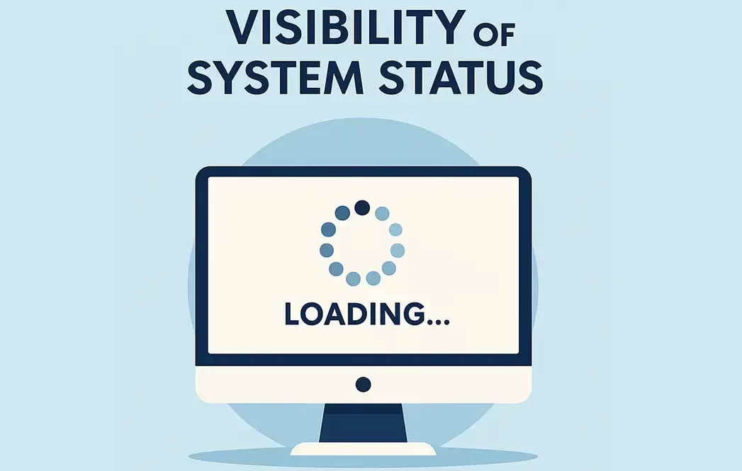
1. Visibility of System Status
The system should always keep users informed about what is going on. For instance, showing a loading icon while an app is processing data helps users stay informed.
When users know that something is happening, it reduces anxiety and builds trust. Animation students can apply this by integrating micro-animations for feedback in app UIs or game menus.
2. Match Between System and the Real World
The interface should speak the users’ language, using words and concepts familiar to them. For example, using icons like a trash bin for “delete” or a magnifying glass for “search.”
This is especially useful in media design, where icons and metaphors help users navigate software or editing tools more naturally.
3. User Control and Freedom
Users should be able to undo or redo actions. Mistakes are common, and the interface should support users in fixing them without frustration.
For design students, this principle is crucial when creating prototypes in tools like Figma or Adobe XD. Always allow the user to backtrack without restarting their journey.
4. Consistency and Standards
The interface should follow platform and design conventions. Users shouldn’t have to wonder whether different words or actions mean the same thing.
For instance, placing the home button in different locations across pages confuses users. Maintain a consistent layout across your portfolio website or design projects.
5. Error Prevention
A good design prevents errors before they happen. For example, disabling the “Submit” button unless a form is fully filled prevents incomplete submissions.
In media production apps, such as video editors or audio software, this can mean prompting the user to save work before exiting. Thinking ahead like this is what separates a good designer from a great one.

6. Recognition Rather Than Recall
Users should not have to remember information from one part of the interface to another. Design interfaces that support recognition.
For example, using visual cues like breadcrumbs or navigation highlights helps users stay oriented within your product, which is essential for large animation software interfaces.
7. Flexibility and Efficiency of Use
Designs should cater to both beginners and experienced users. For example, provide keyboard shortcuts for advanced users, while keeping menu navigation easy for newcomers.
Students can implement this when designing creative tools—offering simple drag-and-drop functionality, along with advanced customization options.
8. Aesthetic and Minimalist Design
The interface should not contain unnecessary elements. Every extra button or icon competes for the user’s attention.
Clean and minimal designs are not just a trend—they improve usability. Whether it’s a portfolio website or a character rigging panel, keeping it simple enhances the user experience.
9. Help Users Recognize, Diagnose, and Recover from Errors
Error messages should be expressed in plain language, indicate the problem, and suggest a solution. Avoid technical jargon.
For example, instead of saying “Error Code 500,” say “Oops! Something went wrong. Please try again later.” This approach humanizes the digital experience.
10. Help and Documentation
Sometimes, users need guidance. Even if your interface is intuitive, offering help documents or tooltips improves usability.
As a UX designer or animation student creating a new app or software, consider including a small tutorial or help center to assist users as they navigate.

How to Conduct a Heuristic Evaluation
Here’s a simple process you can follow to carry out a heuristic evaluation:
- Define the Scope – Decide which part of the interface or which user tasks will be evaluated.
- Select Evaluators – Ideally 3 to 5 usability experts. In an academic setting, this could be peers trained in UX basics.
- Review the Interface – Evaluators go through the interface independently and note usability problems.
- Rate the Severity – Issues are rated based on their impact on user experience (minor to critical).
- Document Findings – Compile a report with issues, screenshots, severity levels, and heuristic violations.